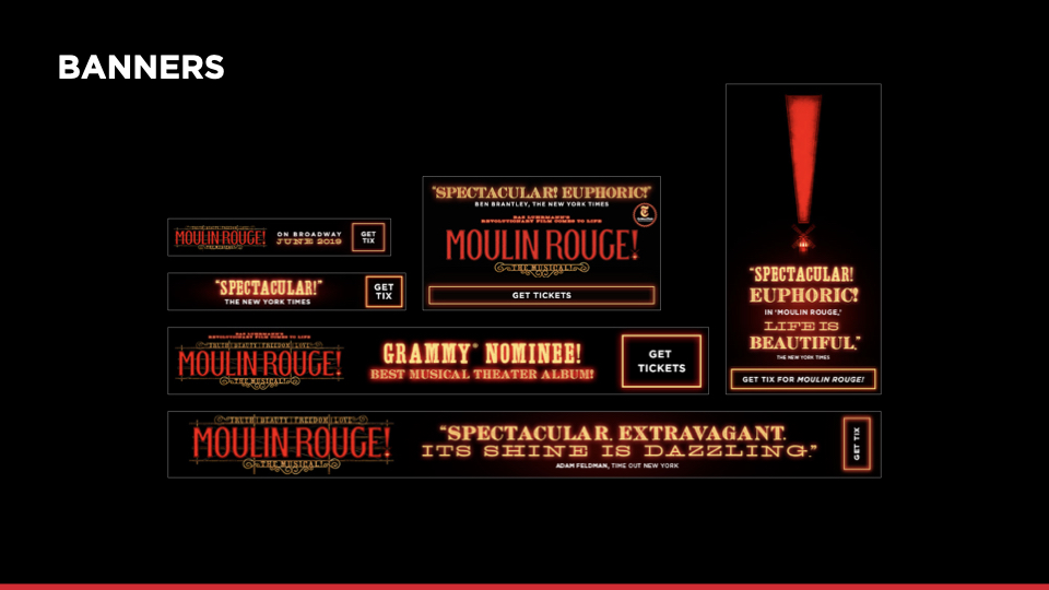
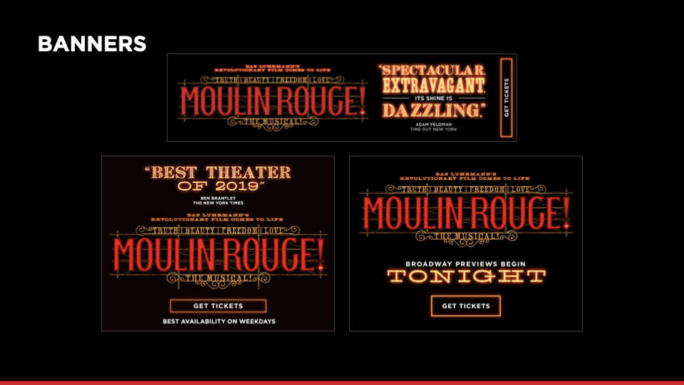
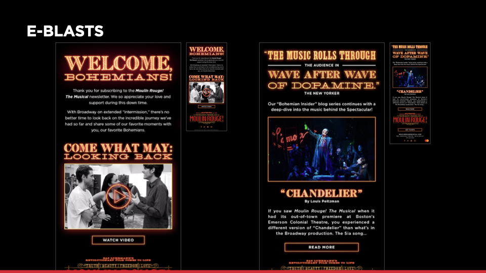
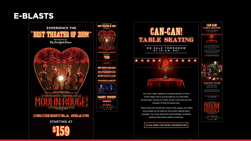
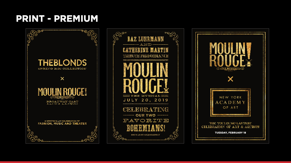
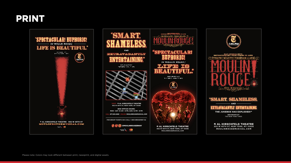
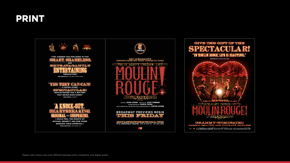
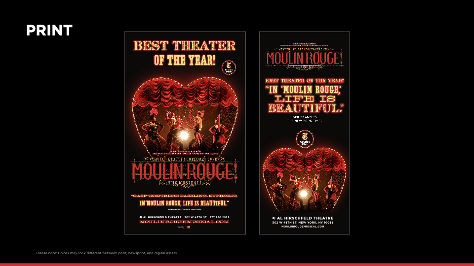
Typography is a big part of the Moulin Rouge! The Musical visual identity’s personality. Below you’ll see all the fonts we use and how we combine them to create glowing type lockups. Please note: The MRP trademark line should be applied to assets as appropriate. These examples below are for type design purposes only and do not display the Moulin Rouge Paris trademark.
Primary Fonts
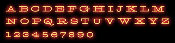
Extended (Archive Antique Extended)
Color
Yellow
Case
ALL CAPS
Size
Flexible
Leading
80% - 100%
Kerning
Optical
Track
100 - 200
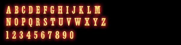
Condensed (Archive Antiqua Extra Cond)
Color
Yellow
Case
ALL CAPS
Size
Flexible
Leading
60% - 80%
Kerning
OPTICAL
Track
0 - 25
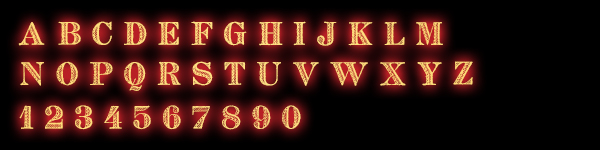
French (Archive French Shaded)
Color
Yellow
Case
ALL CAPS
Size
Flexible
Leading
60% - 80%
Kerning
Optical
Track
50
NOTE: See GENERAL GOOD PRACTICES section below regarding modifying the FRENCH “E”
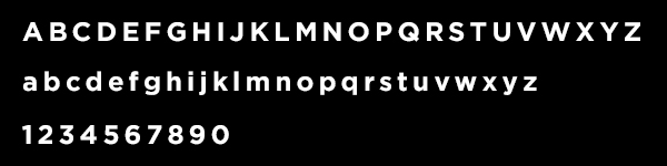
Gotham (Family)
Color
White
Case
ALL CAPS // Sentence case for body type
Size
Flexible
Leading
130%
Kerning
Optical
Track
0 (body type) - 100
Secondary Fonts
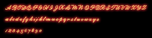
Scripted (Archive Autograph Script)
This font is not very readable, so avoid using it unless it feels appropriate (e.g., assigning a font per Bohemian value, or using it for a romantic/love-related copy line). Always make sure to check its kerning so the type looks scripted.
Color
Yellow
Case
Sentence Case
Size
Flexible
Leading
60% - 80%
Kerning
Optical
Track
0
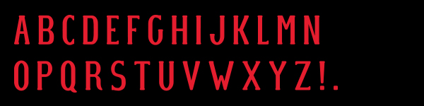
MR Vector Type
This type is custom-made and can be used for graphics. You can style it however you want to depending on the design you're creating. This type is not a font, and only exists in vector form.
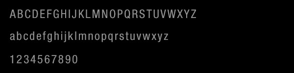
Helvetica Neue Condensed
Use this font only for legal text. Please refer to the DESIGN PAGE for more information about the guidelines surrounding legal type.
LIGHT TYPE SETTINGS
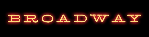
Creating Light Type
In order to create light type lockups, it is recommended to lay it out in Illustrator first. Once you're satisfied with your type, copy and paste it into Photoshop, and apply the glow according to your work space.
The glow works differently in RGB and CMYK:
RGB Glow Settings
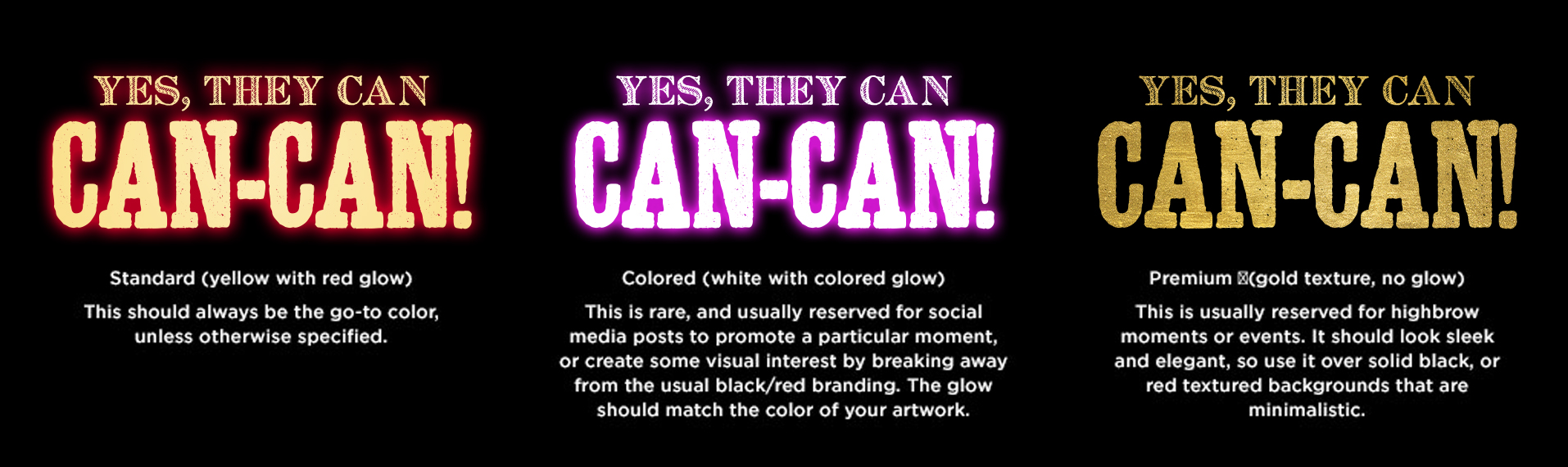
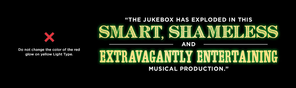
The glow is made by a Layer Style that consists of a red Outer Glow. The size of the Outer Glow varies depending on the size of the type, so please adjust the Size and Spread settings to look similarly to the example attached. If needed, you may also adjust transparency. Please download the file below, and copy and paste the Layer Style, or use the settings below as a starting point:
Effect
Outer Glow
Hex
#CC2229
Opacity
90%
Spread
4
Size
16
CMYK Glow Settings
The red glow doesn't translate as well on print as it does on digital as it creates a washed-out appearance. In order to make the red glow richer, follow these steps:
1. Lay out your type in a group or Smart Object, and apply the Layer Style with the red glow.
2. Make a copy of it. (if your type is a Smart Object, right click on the layer and select "New Smart Object via Copy" to create an independent copy).
3. Change the color of the type from yellow to red.
4. Apply Gaussian Blur.
5. Make 2-3 copies of the blurred red type group to create a denser glow.
Please download the file below to see how it is set up.
Designing light type
Using a mix of glowing Archive fonts to highlight words and phrases in an artistic way, while including Gotham to create visual hierarchy, is what we call “Light Type.” This helps to keep the attention on the message you want the reader to take away. The main challenge in designing Light Type is making sure it feels balanced and comfortable to read in spite of using multiple fonts.
Before designing your Light Type, please take the following into consideration:
- What is the intention of the copy? If you want to communicate a particular message, you will want to put emphasis on certain words and make sure the Light Type is readable and easy to scan.
- How long is the copy? This will inform how much Gotham you will need to use. Short copy (such as headlines or short quotes) can rely on Archive fonts with minimal use of Gotham (or none). However, long copy (such as long quotes) will probably need heavier use of Gotham to create some visual balance and avoid eye strain.
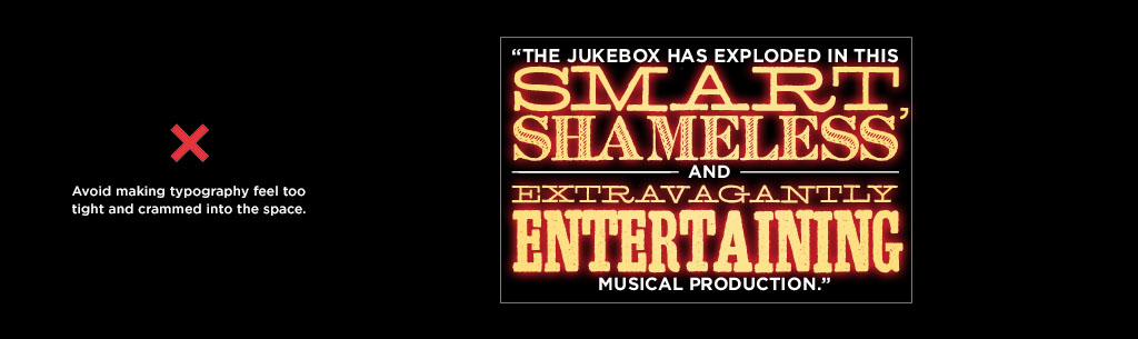
- What is the space you have to work with? Is it horizontal, vertical, or squared? Is it large or small? This will give you an idea of how you will need to distribute your copy. Make sure you include margins so that the Light Type has some clear space around it. Light Type should not feel crammed. If the copy is too long, consider making a shorter version that fits your space comfortably.
- How will you break down the text? Inserting line breaks coherently will make the Light Type easier to read and will help you determine which fonts fit better in the space you have. Archive fonts can be used to play with space and prominence. Gotham is reserved for non-essential words such as articles, prepositions, or phrases that contextualize/complete the full thought.
Things to note
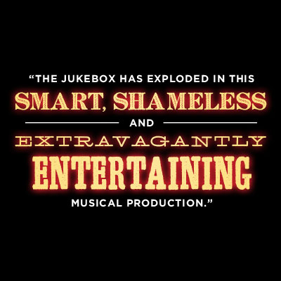
Light Type Example
Let’s take, for instance, the following quote from The New York Times:
“The jukebox has exploded in this smart, shameless and extravagantly entertaining production.”
For this medium-length quote, we would like to bring attention to the three most captivating adjectives used to describe Moulin Rouge! The Musical: smart, shameless, extravagantly entertaining. The rest of the text is not essential and can fall back visually.
Following the type settings described on the Fonts page, this is one way this quote could look in a square format:
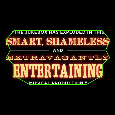
Things to note: Shape
The text is aligned at the center, and each line is sized in a way that creates rags on the sides that are similar to the natural rags you would get with centered text, creating a uniform cluster shape. This makes the text feel focused and organic.
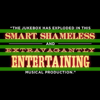
Things to note: Spacing
The spacing between each line is consistent throughout.
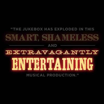
Things to note: Fonts
Because “extravagantly” is an adverb for “entertaining”, it feels right to use the Extended font so its size can be reduced while keeping a decent, readable width. Meanwhile, the Condensed font is used on “entertaining” to shorten its length and add some height to the full Light Type lockup.
Things to note: Clear space
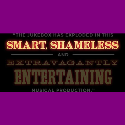
“Smart” and “shameless” could have been broken into two different lines. However, it would mean these two words might need to get bigger and occupy a lot of vertical real estate. Keeping them in the same line helps to add some breathing room at the top and the bottom, making the lockup feel easier on the eyes. There is no need to make the copy as big as possible (unless it has an intention). White space will always make Light Type feel balanced.
Things to note: Gotham
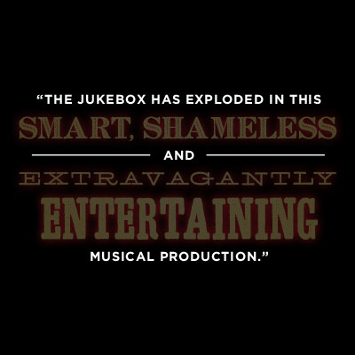
The rest of the copy helps to make the lockup read like a full sentence, but it is not visually essential. In order to avoid distracting or overwhelming the reader with too many bright fonts, Gotham is used on these parts to de-prioritize them and keep the attention where we want, making the quote easy to scan.
Things to note: Resizing
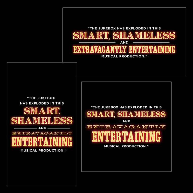
Because space is such an important element when designing Light Type, it might be unlikely that you will be able to reuse one Light Type lockup across other assets with different dimensions. Instead, it is recommended that you adjust the fonts, sizes, and spacing so it fits your dimensions in a more natural way.
For instance, you might be able to use the same Light Type lockup for both 300x250 and 300x600 banners because they have the same width, but it is quite possible you will need to adjust or redesign the typography to fit a 160x600 banner.
In the following sample, the previous quote has been adjusted to fit better into horizontal and vertical formats. Notice how the number of lines was reduced for the horizontal asset, while it was increased for the vertical asset. These adjustments make the Light Type feel custom-made for its particular space.
MAKING THE BEST USE OF SPACE: HEIGHT
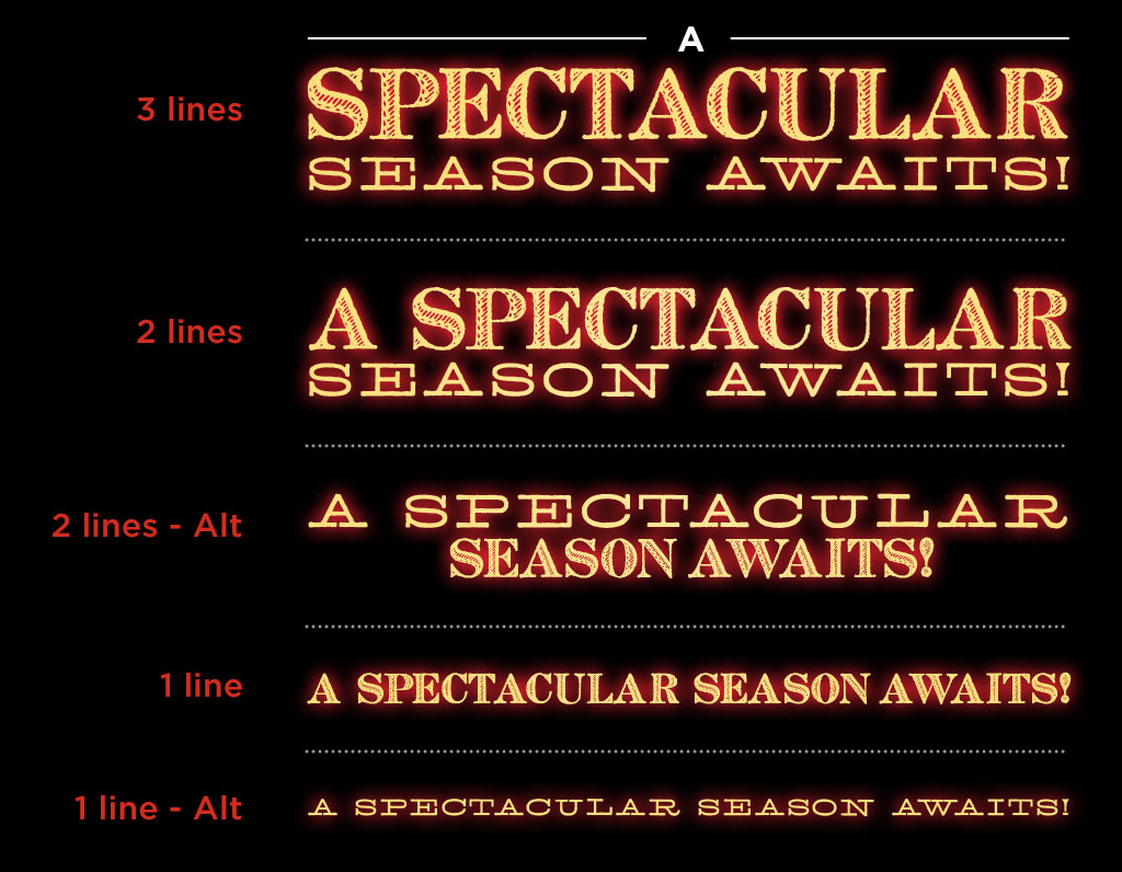
Archive fonts have three different widths that provide a lot of flexibility to play with space, so use this to your advantage. In this sample, a single headline has been resized into five different options to fit different heights.
MAKING THE BEST USE OF SPACE: COPY LENGTH
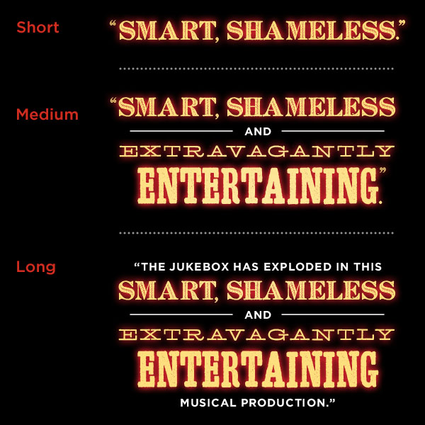
It is also a good idea to cut down the copy to fit assets with different dimensions. Longer copy might need more use of Gotham to balance the Light Type. Shorter copy may rely solely on Archive fonts.
Font Properties
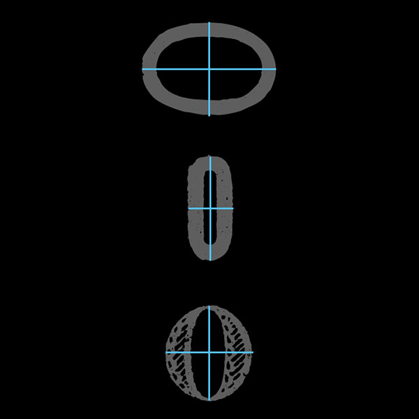
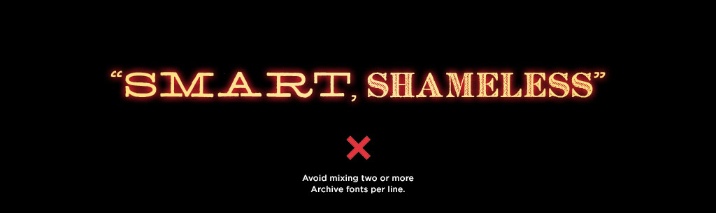
You are allowed to mix and match Archive fonts to meet your space’s needs. However, take their respective characteristics into consideration when using them:
- Extended: This font is great to use when you need a word or phrase to occupy more width. However, its short height might make it hard to read at very small sizes, and might make a long string of words feel even longer and harder to read.
- Condensed: The narrow nature of this font makes it great to use when you need to fit long words or phrases into narrow spaces. In wider spaces, however, it might look clunky for short words, so make sure your Condensed text is long enough to feel balanced with the rest of the text.
- French: This font has the closest proportions to basic typography, so it is the most readable at different sizes and is best for longer strings of words. However, the cutout details inside this font makes the red glow pass through the characters, giving them a fuzzy look at smaller sizes.
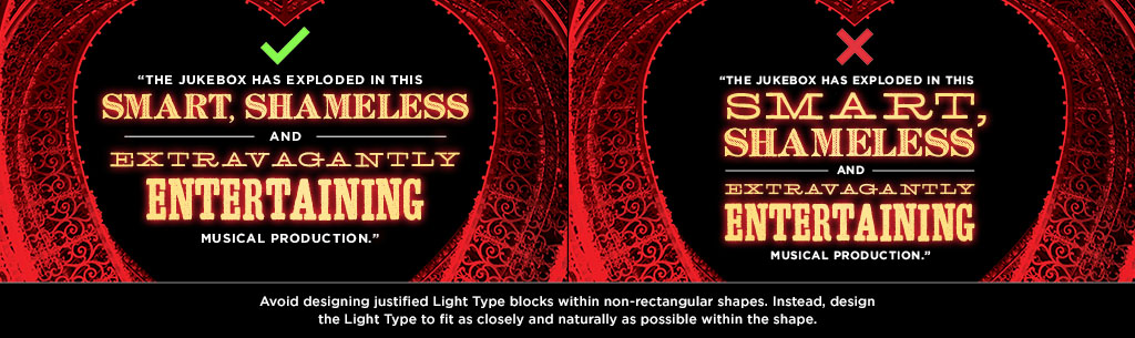
JUSTIFIED ALIGNMENT
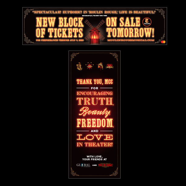
Even though the preferred type of alignment for Light Type is centered, there are some instances in which justified alignment would fit best. These instances include, but are not limited to:
- When designing Light Type in a rectangular block with uniform margins or close to the edges of the artwork
- When designing within a narrow or small asset and you need to make the most of out the space available
VISUAL IMPACT OVER READABILITY
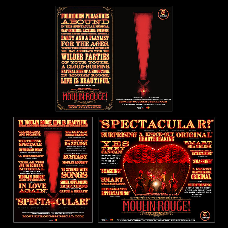
On particular moments, the intention of the Light Type is to provoke a specific visual effect, so it is designed in a way that puts more emphasis on the visual layout rather than on readability. These kind of layouts are reserved for big moments to show grandiosity and a quantity of great reviews.
GENERAL GOOD PRACTICES
Combining fonts
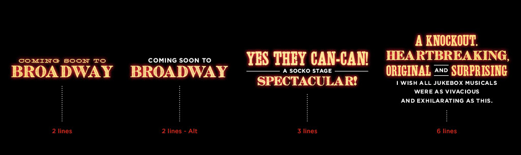
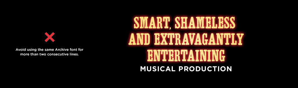
- Combine Archive fonts with Gotham depending on the number of lines you have:
- Short-length text (1–2 lines) can rely solely on Archive fonts. If there are 2 lines, you may include the Gotham font for text that is less important.
- Medium-length text (2–4 lines) may include some line breaks in Gotham (even if they are just prepositions or short words that are less important) to ease eye strain and improve readability.
- Long-length text (5+ lines) should be balanced with heavier use of Gotham for sentences or phrases that are less important.
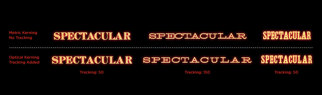
Kerning
- Make sure to set your type to optical kerning, and track out each font as indicated in the fonts section. This will add some air between letters and make them easier to read.
- When typing certain letters in the Archive fonts, like V and A, the spacing between the letters can appear larger than usual. To ensure a consistent appearance with the rest of the word, you should adjust the space between these letters.
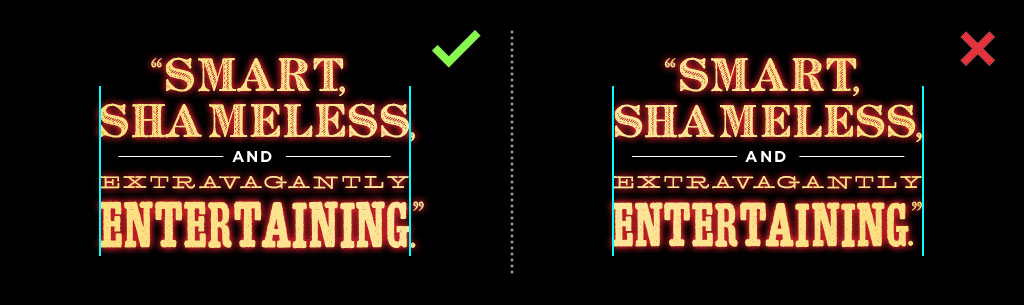
Hanging Punctuation
- Quotation marks and punctuation should hang if the text is justified; otherwise words are going to look off-center.
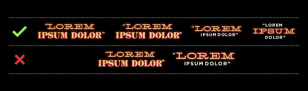
Quotation Marks
- Both quotation marks should be the same font. The font must match the font of the first or the last line of your Light Type, unless there is Gotham — in which case, use Archive quotation on the Archive line, and Gotham quotation on the Gotham line.
Punctuation Size
- It is preferred to subscript or superscript some punctuation marks (such as quotation marks, periods, commas and semicolons) and adjust their baseline, as they tend to feel bulky.
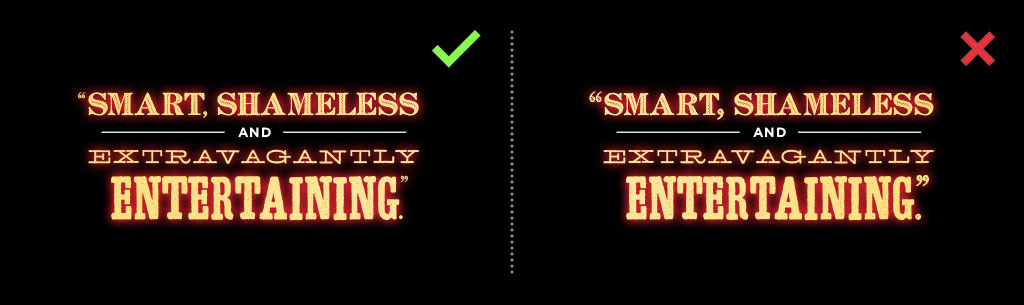
Simplifying punctuation
- You may simplify punctuation marks as needed (such as periods, colons, hyphens, dashes) to make Light Type layouts visually pleasing. Make sure it is still communicating the message correctly, even if it is missing some standard punctuation. Quotes should keep their punctuation marks where applicable.
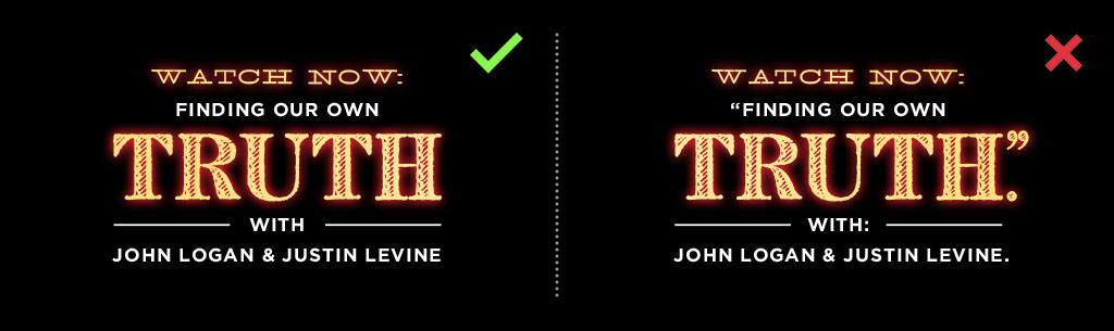
Rules
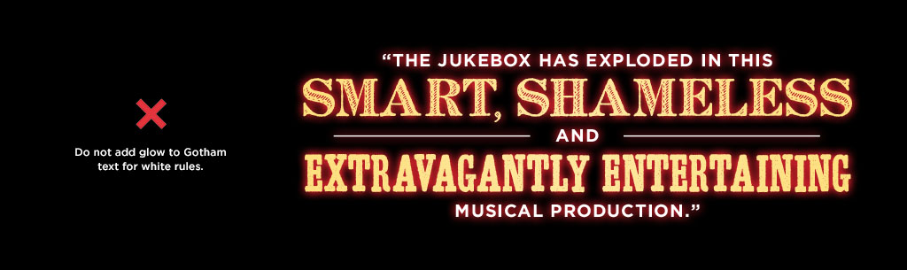
- Rules should extend to the width of the longest line of text. In some cases, rules may be slightly shorter, but they should never exceed the length of the longest line.
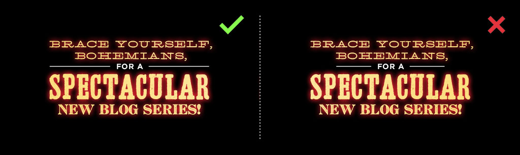
- If the Gotham copy line is shorter than 50% of the Light Type width, please add rules to the sides and extend them closer to the longest line.
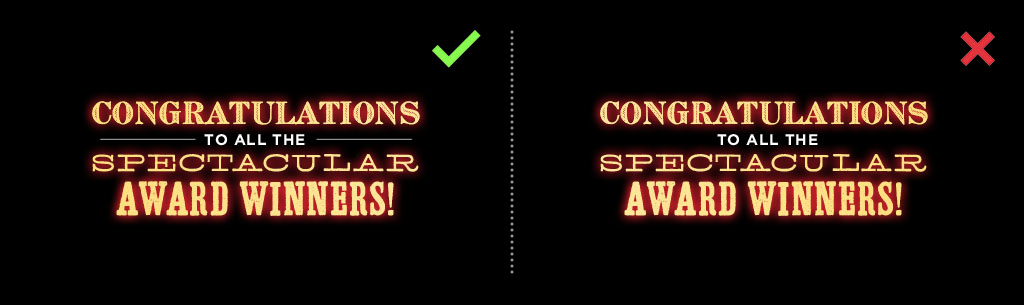
Gotham size
- Archive fonts can use different sizes on the same Light Type lockup. Gotham, however, must always be the same size within the copy lockup (except for the attributions for quotes, which can be set at a smaller size if needed).
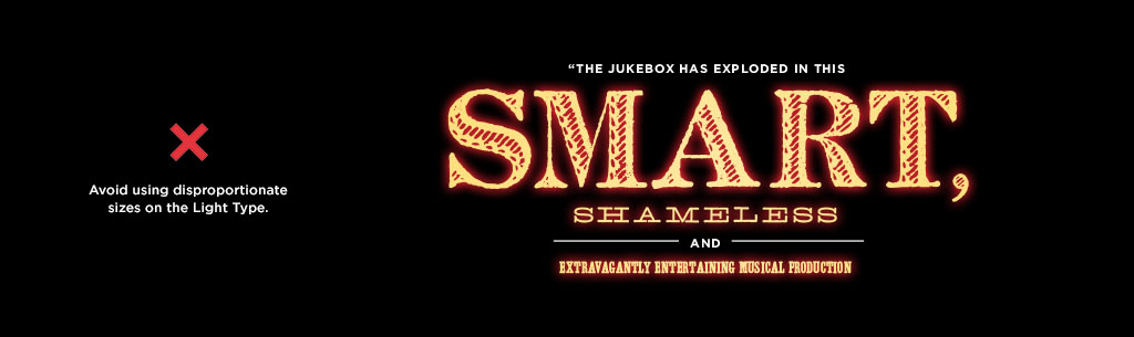
- Gotham fonts should never be bigger in width or length than Archive fonts.

Small Assets
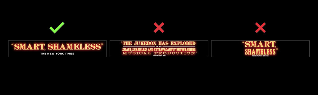
- Avoid filling small assets with too much copy. Instead, consider cutting the copy down so it fits in a readable way, while keeping its essence.
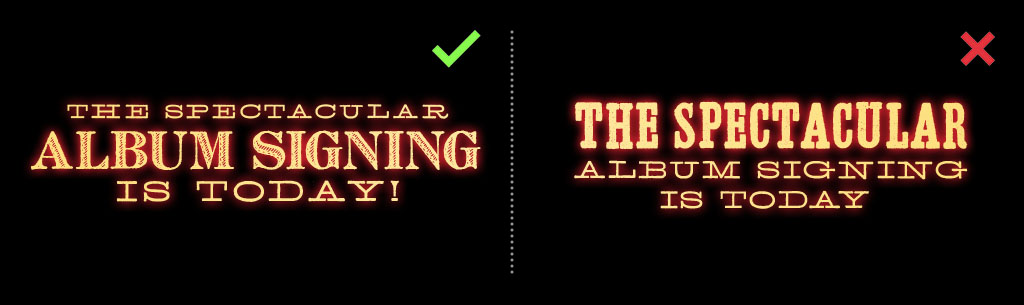
Emphasis
- Make sure you put the emphasis on the most important words so the reader can get the message quickly.
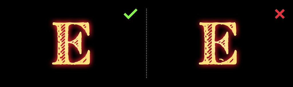
French "E"
- Whenever possible, make sure to remove the tick in the French “E” letter. You can achieve this by masking it out on Photoshop, or by outlining the type in Illustrator and deleting its anchor points.
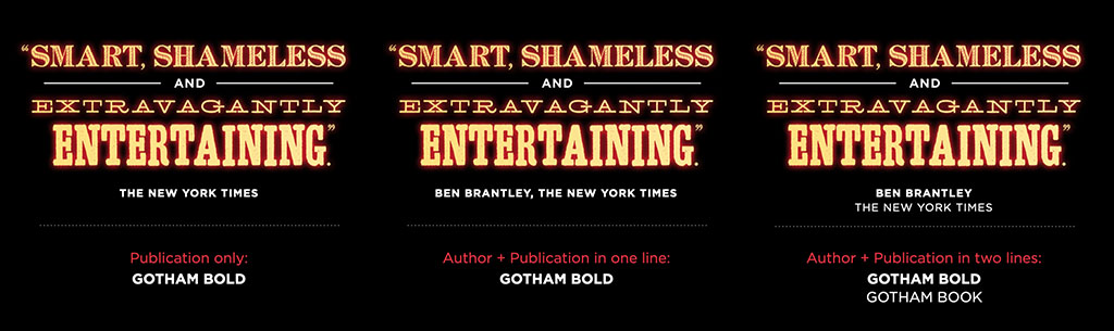
Attributions
- Attributions always go in Gotham (can be set at a smaller size if needed), using one of the following three formats:
Color
Backgrounds
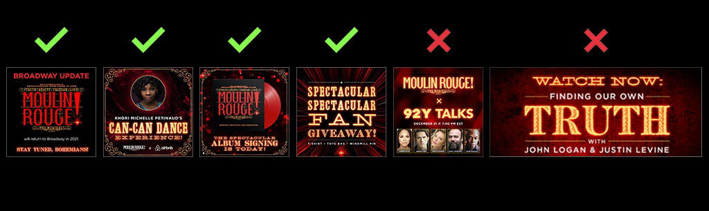
It is highly preferred to use the Light Type over solid black backgrounds, as this makes the red glow display correctly.
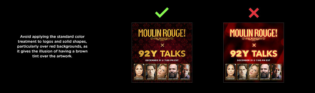
Be mindful of using Light Type over red backgrounds, as this might make the red look brownish and/or diminish the red glow effect. If you’re using textured red & black backgrounds, make sure they have enough black in them so that the red glow is visible. You can always achieve this by playing with the Levels, Brightness/Contrast, and other Adjustment Layers in Photoshop. If the images are full color, make sure to change them to black and white, and add a layer with the MR Red color, using the blending mode that works best (usually Multiply or Overlay). This way, you can create visually interesting backgrounds without compromising the Light Type’s design.
Heart portal
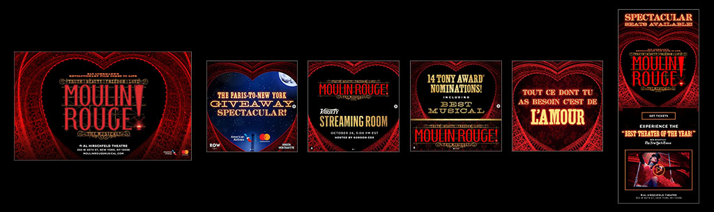
The heart portal is a large photograph of the Moulin Rouge! The Musical set. We usually crop the image tightly around the heart and use the black space to frame content such as the Moulin Rouge! The Musical logo, Light Type, logo lockups, and some art. When using this asset, please take the following things into consideration:
- Make the content fill up the space, while keeping a uniform margin around it.
- If you’re placing Light Type in the black area, design it in a way that “wraps” inside the shape.
- As explained on pg. 31, Light Type doesn’t read well over red backgrounds. If you’re placing Light Type on the red areas, make sure you add black gradients with blending modes to darken them and add contrast.
- You may crop the bottom and the sides of the black area. However, avoid cropping the top area as this is what makes the shape read as a heart.
- You may fade out the bottom of the heart by using black gradients when necessary.
- Please try to use this asset sparingly so it doesn’t feel repetitive, and make sure to keep the placement consistent on social graphics.
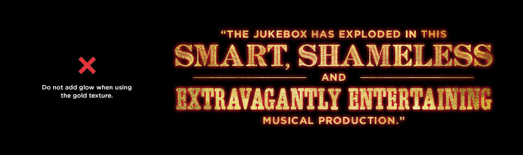
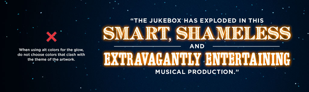
DON'TS
DESIGN SAMPLES