BEST PRACTICES GUIDE
Please read the Advertising Best Practice Guide for support with the roll out of information on this page.
Advertising Best Practices Guide
Please read the Advertising Best Practice Guide for support with the roll out of information on this page.
Advertising Best Practices Guide
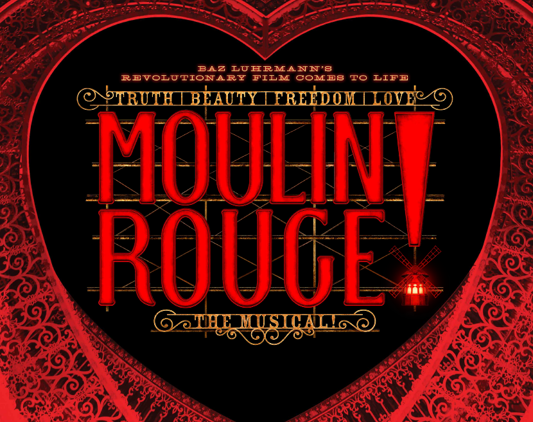
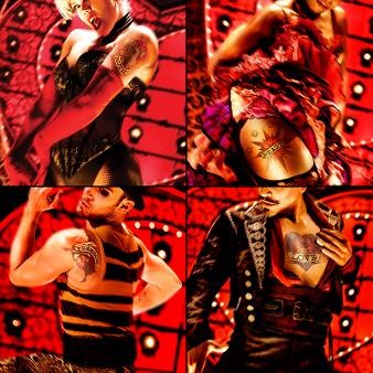
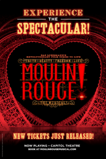
The launch of the brand should be minimal and confident, relying heavily on name recognition and strategic micro-glimpses of the world of the show. Examples of this include the Bohemian tattoo teaser posters and the Bohemian value teaser trailers. Copy should be anticipatory and invitational, with a dash of mystery. Launch creative should rely almost entirely on the logo, a copy line and support from the bohemian value tattoos where necessary.
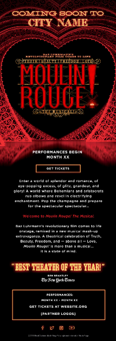
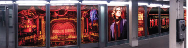
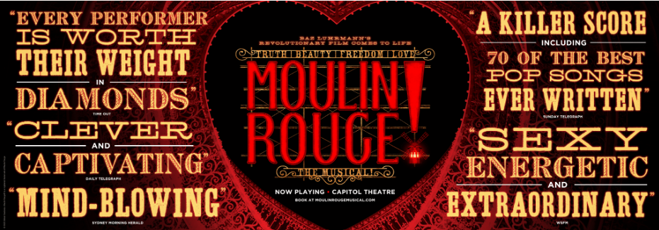
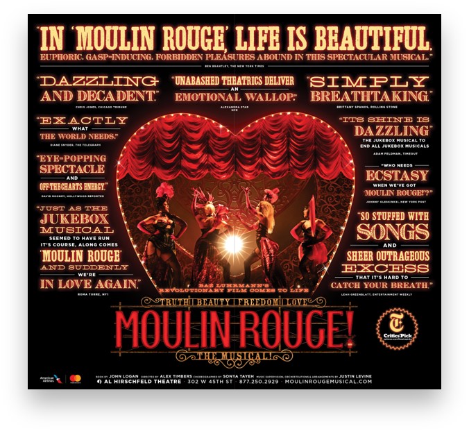
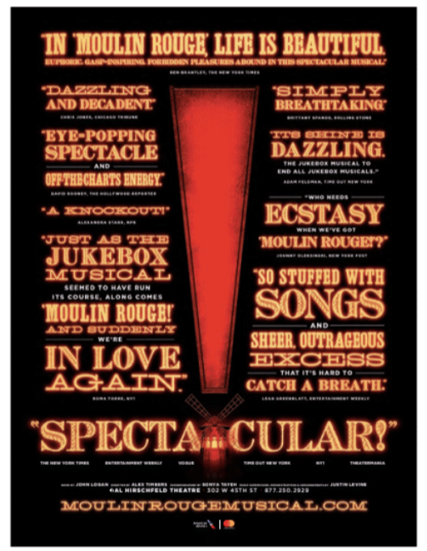
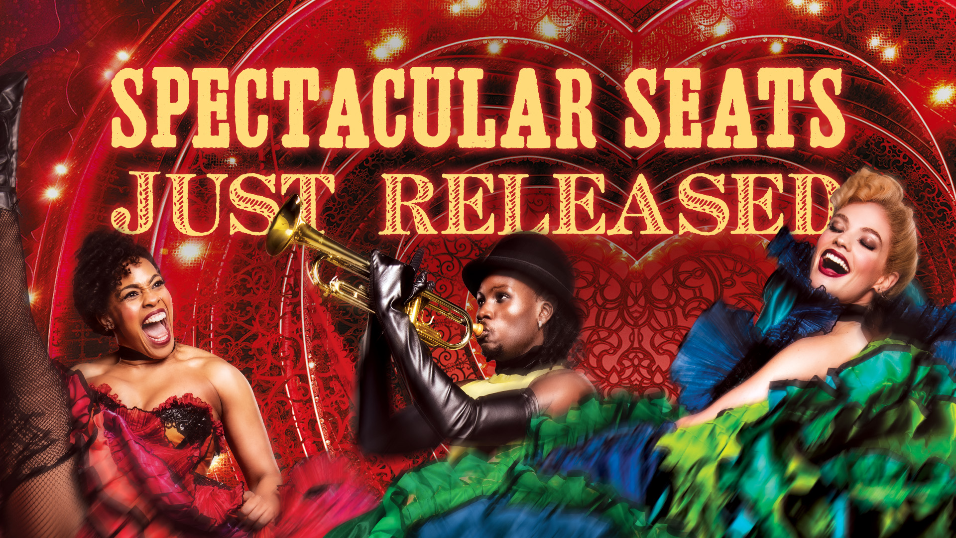
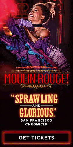
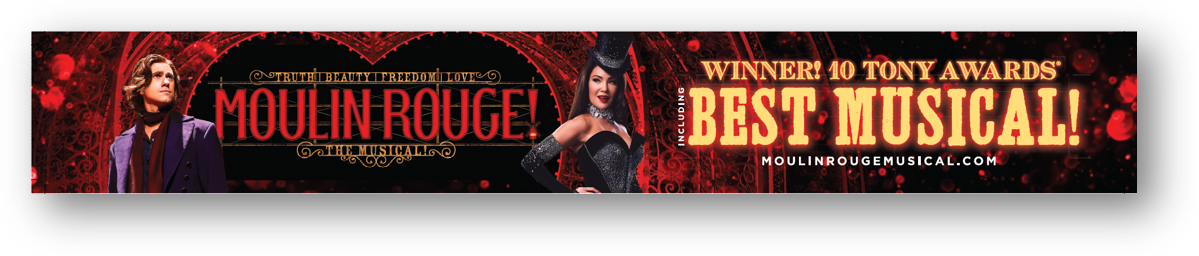
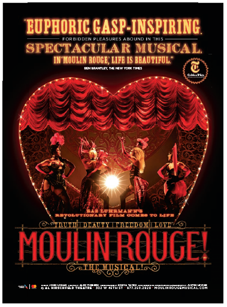
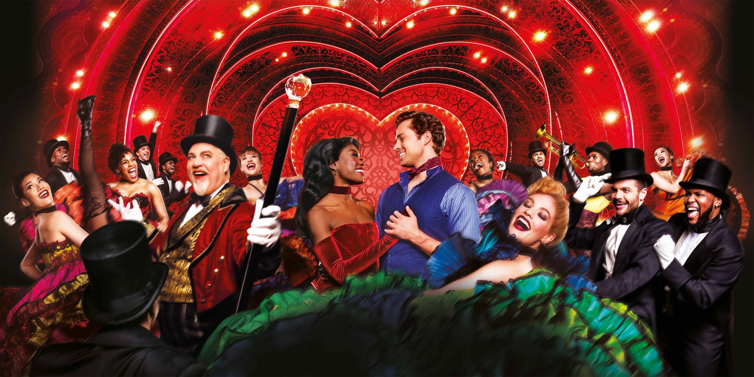
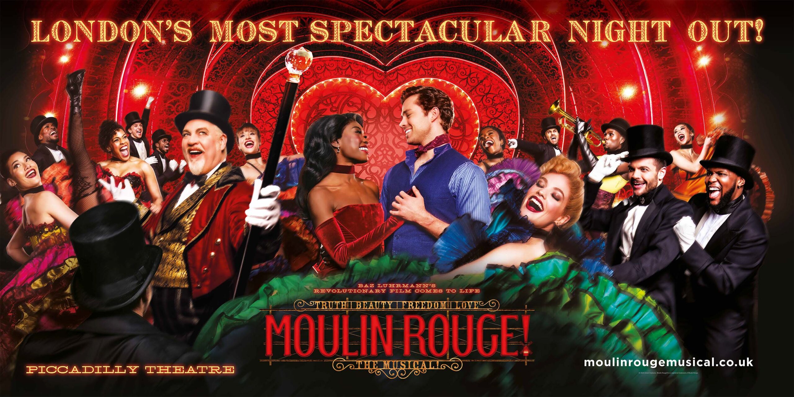
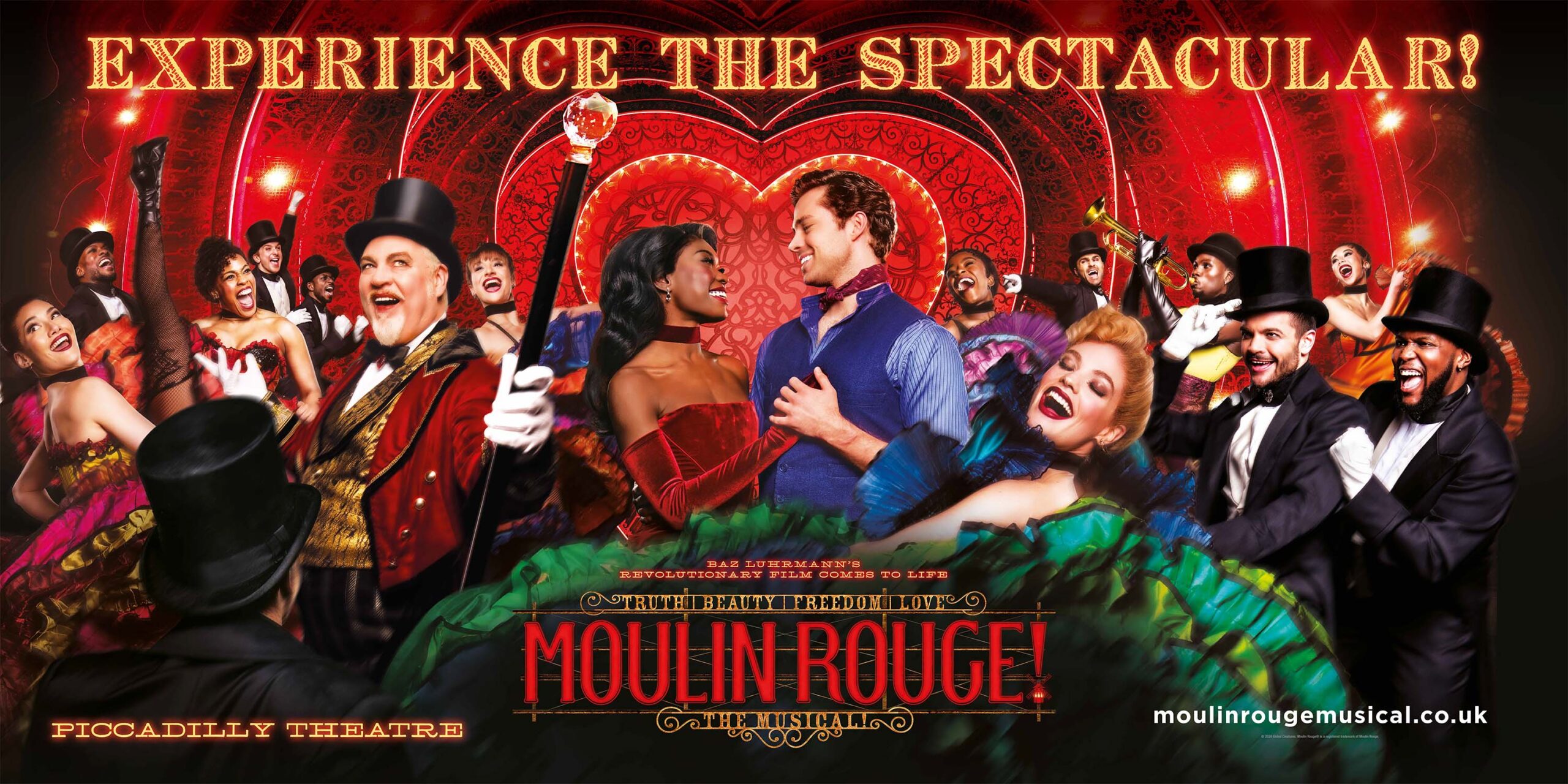
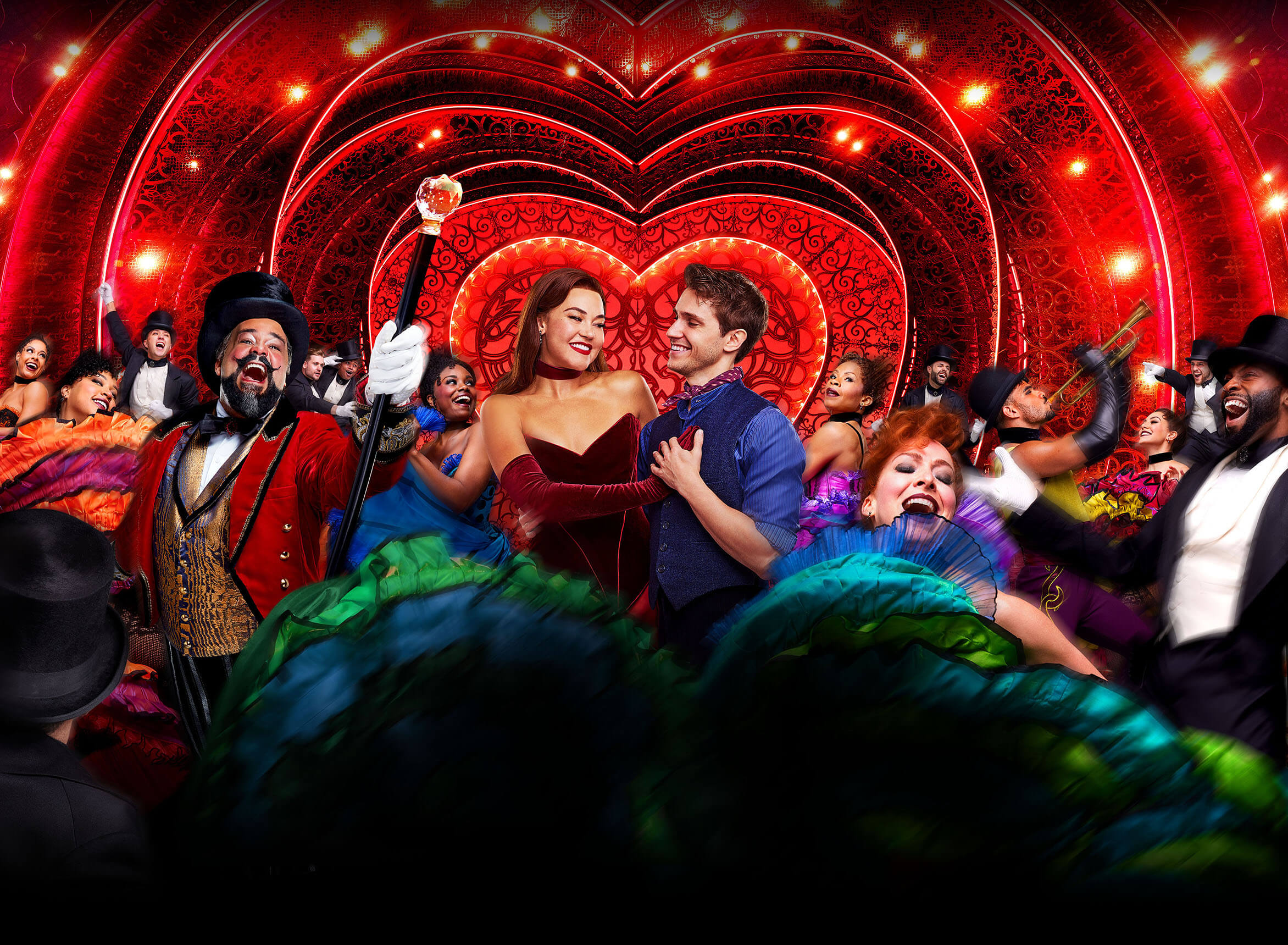
KEY MESSAGING:Pop the champagne and confetti! Once the show has opened, this is the moment to celebrate and get maximal in execution: wall to wall accolades, the addition of select production imagery revealing the lush red world of the show, confetti spilling across our logo in motion creative. The reviews are out, and we begin to incorporate our reviews in a quotes campaign. Post-opening should feel like a party, while maintaining a direct visual throughline to our core visual identity.
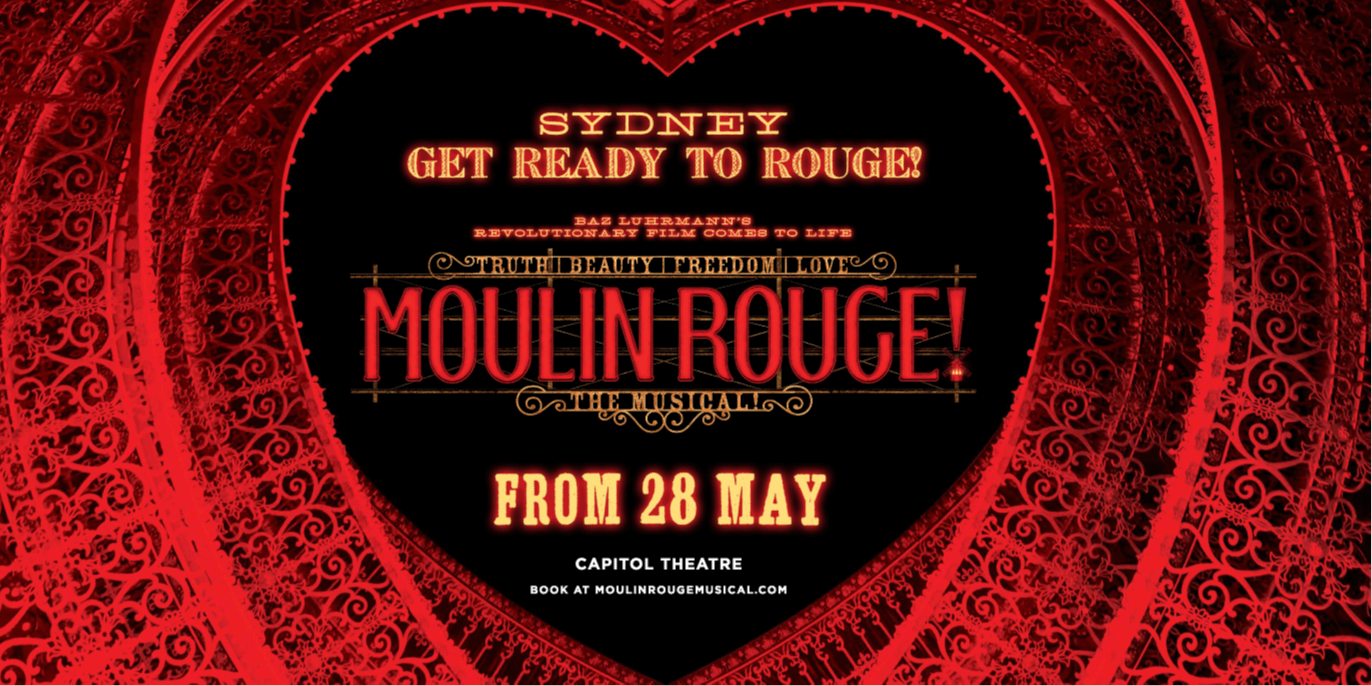
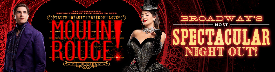
This phase is after the press opening and critics’ reviews with creative that can include critics’ quotes but typically still using the heart portal/key art logo, Lady Ms or red exclamation mark.NOTE: EVERGREEN/ONGOING or POST-OPENING phases should always include a mix of core-visual identity (MRTM Show Logo either on all-black background or in the heart portal) with other varied messaging (some executions with reviews/quotes and/or other key messaging, e.g. “spectacular,” romance or party) to fill out the media mix.
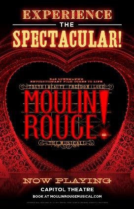
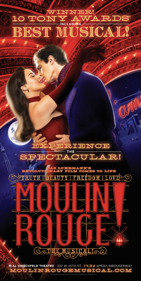
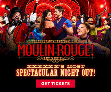
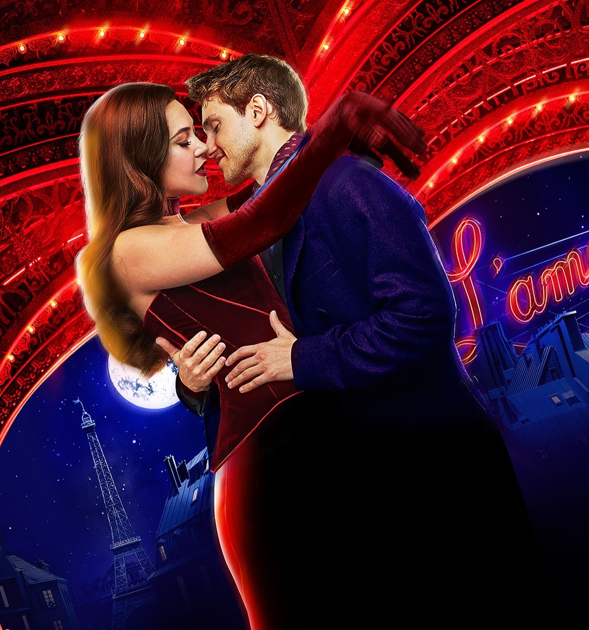
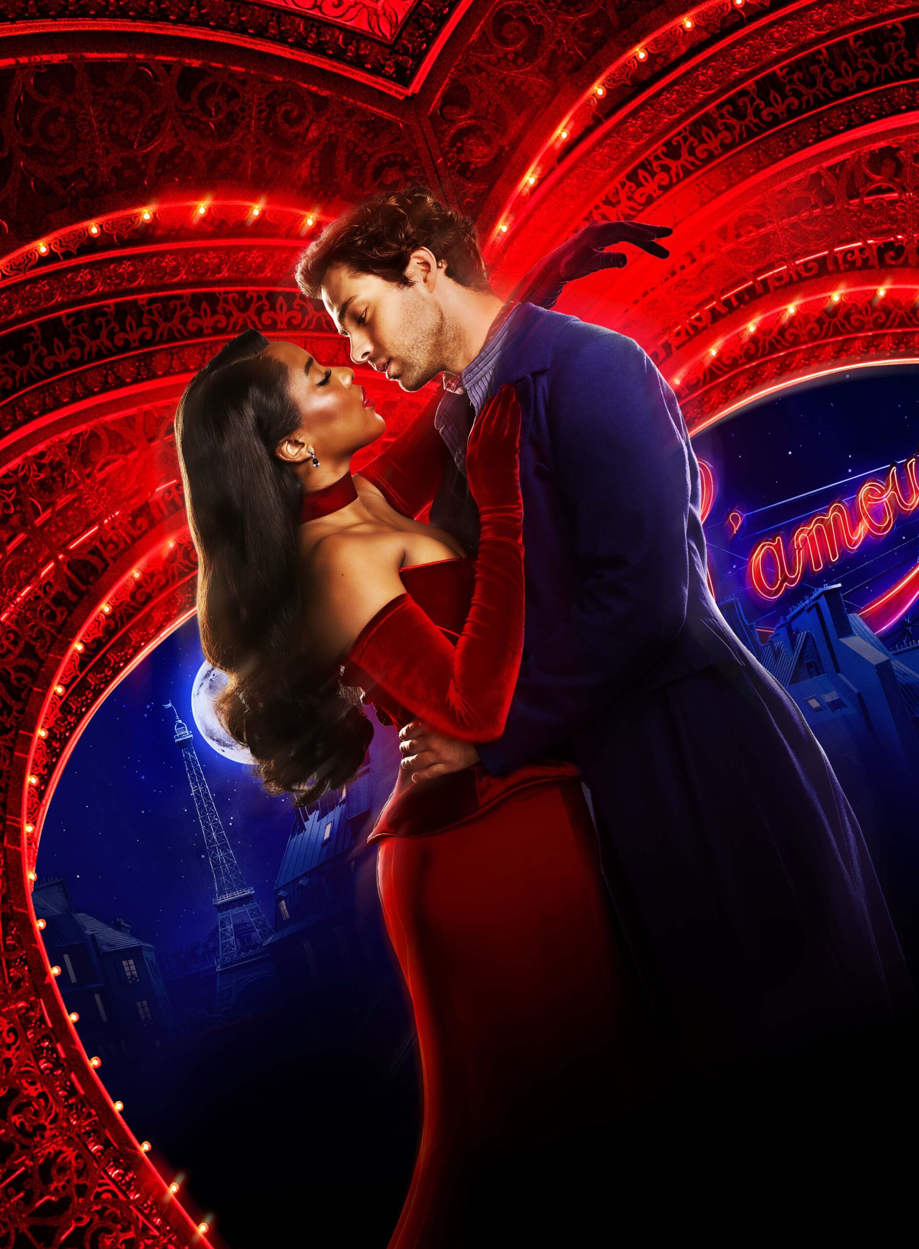
As we move away from opening night, the visual identity can trickle back to a more moderate approach, with the occasional celebratory punctuation. An appropriate balance of sensibility would be 3/4 launch minimalism, ¼ post-open spectacle. Additional photography can be introduced into the campaign: Zidler with arms extended, welcoming audiences to the Moulin Rouge. Satine and Christian embracing. This photography should be drenched in red or colour neutral in a way that complements the core visual identity. Avoid heavy blues, greens, pinks, etc. While the visual identity should be steady and confident in its simplicity, there are opportunities to propose moments of specialty creative for further market impact. For example, long-running productions may introduce “romance” and “party” artwork.
KEY MESSAGING: